


.avif)

Healthcare Web Design That Increased Online Bookings by 200% for a Mental Health Clinic – No Fear Counselling
A 200% increase in online bookings, 60% rise in conversions, and 85% more mobile engagement—this is what happened when No Fear Counselling partnered with us to overhaul their digital experience. We combined accessible web design, marketing automation, and strategic branding to create an inclusive healthcare website that serves the needs of mental health clients across Vancouver. The result? A HIPAA-compliant platform that feels human. This project shows how thoughtful healthcare UX/UI can deliver measurable growth for therapists and clinics alike.


Working with the Setsail team has been amazing. Their work is top notch, their communication is excellent, and it just was a really fun collaboration from start to finish. Highly recommend!

Matthew Hansen
Founder at Wunderkids
How Our Digital Marketing Agency Drove Growth

Healthcare Booking System That Increased Conversions by 60%
We streamlined the booking journey with clear CTAs and simplified steps. Clients could now schedule appointments without confusion or delay, resulting in a 60% increase in conversion rates within the first three months.
Accessible Web Design That Boosted Mobile Use by 85%
We built the site to WCAG 2.1 standards with intuitive mobile navigation. This accessibility-first approach made the site easier to use on any device—leading to an 85% spike in mobile engagement from new and returning visitors.
Therapist Branding That Reduced Bounce Rates by 40%
We replaced sterile clinical visuals with friendly typography, calming colours, and real images of connection. This new brand direction helped visitors feel safe and understood—dropping bounce rates by 40% and increasing time on site.


Healthcare Web Design That Drove 200% More Bookings and Built Lasting Trust
Context & Challenge
When No Fear Counselling came to us, they weren’t looking for “just a new website.” They were looking for a transformation.
As a mental health clinic operating across British Columbia, they had grown significantly—offering therapy through dozens of practitioners across multiple regions. But their digital presence didn’t reflect that evolution. The website was dated, confusing to navigate, and didn’t make it easy for new or returning clients to book with confidence. Worse, it lacked accessibility—leaving some users unable to access care altogether.
The stakes were high. When someone reaches out for therapy, the first impression can make or break their willingness to take the next step. Clunky forms, inaccessible menus, or overly clinical design elements can discourage someone who’s already struggling to seek support.
We knew the opportunity went beyond a site refresh. This was a chance to use healthcare web design and UX strategy to create a welcoming, inclusive digital experience that felt safe, clear, and easy for anyone navigating mental health services.
Approach & Strategy
We began with discovery—starting with user research sessions, stakeholder interviews, and a competitive audit of other therapist and healthcare websites. Through our Vision Mapping™ process, we identified two major challenges:
- The site’s architecture was overloaded. Visitors had to click through multiple layers just to find the right therapist, location, or booking form.
- The tone was too clinical. Mental health care requires trust and safety. The old design lacked warmth and felt more corporate than compassionate.
We aligned on a strategy that merged four core disciplines:
- Accessible web design, guided by WCAG 2.1 and HIPAA compliance
- Marketing automation to simplify booking and improve retention
- UX-focused content strategy to clarify services and pathways
- Mental health branding to build emotional connection with users

Creative Process
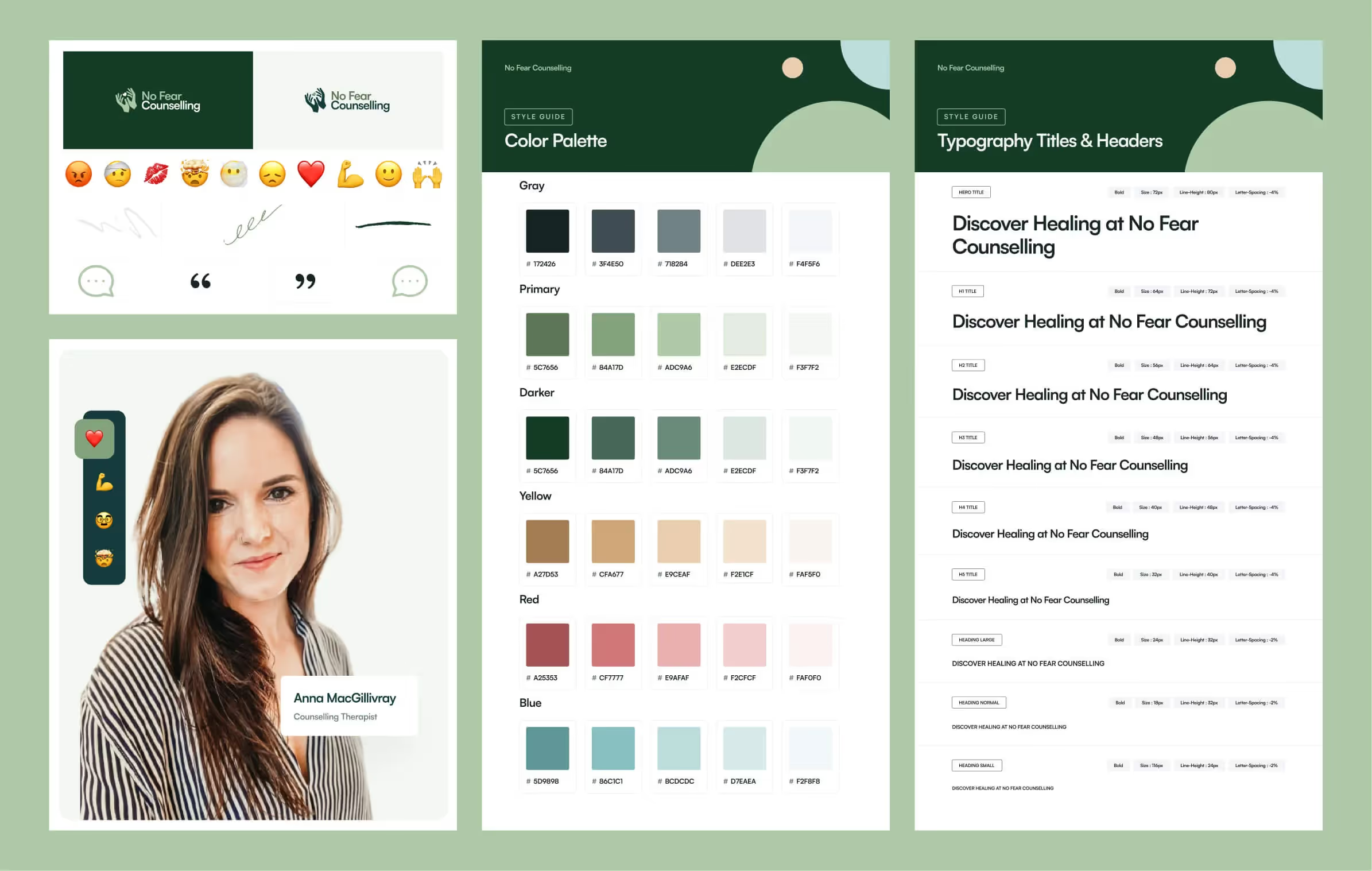
With a clear roadmap, we shifted into design. But first, we aligned on tone: the brand needed to feel professional—but not cold. Supportive—but not overly casual. We used colour psychology research to develop a palette of forest greens, neutrals, and warm greys—evoking calm, safety, and grounding.
From there, we built out a flexible design system tailored for therapy-specific use cases. For example:
- Mobile-first navigation for users in crisis who may be using their phone
- Profile cards that allowed users to easily scan therapists by modality, background, and languages spoken
- Conversational CTAs like “Ready to talk?” instead of generic buttons like “Submit”
We also sourced friendly, real-world imagery that felt relatable and inclusive—avoiding overused stock photos that feel disconnected from the lived experience of therapy.


Execution & Deliverables
We rebuilt the entire site in Webflow to allow flexible content management while meeting healthcare privacy and accessibility standards. Every page, interaction, and form was designed with intent.
Deliverables included:
- A fully responsive, WCAG 2.1 compliant website
- HIPAA-aware form integrations for bookings and contact
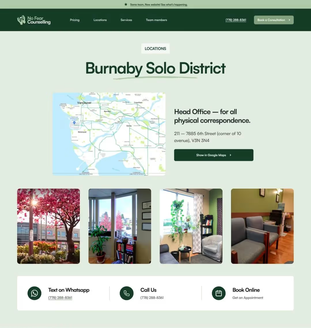
- Branded therapist profile directory with filtering
- Custom “No Fear Blog” hub for mental health content
- Scalable landing page templates for clinic locations and partner services
We also integrated marketing automation tools through our Marketing Lab™ stack—connecting booking flows to CRM tagging, email reminders, and service-specific follow-ups. This significantly reduced the friction for clients looking to book, and empowered the clinic to track conversion bottlenecks.
Tangible Outcomes
Once launched, the results were immediate.
+200% increase in online bookings
Our booking system overhaul—combined with strategic CTAs and layout—led to a 3x increase in appointments scheduled through the website.
+60% improvement in conversion rates
Users were completing their booking flows at much higher rates thanks to simplified paths, clearer service descriptions, and lower friction points.
+85% mobile engagement growth
The accessibility-first mobile design led to a major lift in mobile session duration, scroll depth, and page interaction.
-40% bounce rate
By reworking the layout, removing dense jargon, and improving page speed, more visitors stayed, explored, and took action.
Patient satisfaction scores averaged 4.8/5
No Fear Counselling saw overwhelmingly positive feedback from clients engaging with the new platform. The brand felt human, clear, and safe.

Lessons Learned & What’s Next
This project reminded us of a key truth: the most important design elements are often the most invisible. Thoughtful spacing, simplified language, inclusive UI choices—these decisions are quiet but powerful.
By partnering closely with No Fear Counselling, we didn’t just deliver a custom healthcare website. We created a digital space that reflects the empathy, care, and professionalism of the people behind the scenes. That’s what a great brand does—it builds trust before a word is spoken.
For other clinics, therapist networks, or healthcare providers looking to modernize their digital experience, the path is clear:
- Start with your users
- Simplify their journey
- Make every interaction feel safe and intentional
Ready to Reimagine Your Mental Health Website?
Explore our web design services or book a discovery call to see how we can help your organization deliver better outcomes through inclusive digital strategy.
Project FAQs
How does healthcare web design improve patient booking rates?
A well-structured healthcare website removes barriers to booking by simplifying navigation, clarifying services, and using conversion-focused layouts. In this case, our redesigned booking system helped increase online appointments by 200% through clear CTAs and reduced friction.
What makes therapist website design different from other industries?
Therapist websites must balance trust, privacy, and emotional safety. Unlike retail or SaaS, design choices here affect whether someone feels comfortable seeking help. Our UX approach prioritizes warmth, clarity, and accessibility for therapy clients.
Why is ADA-compliant or accessible web design important in mental health?
Accessible web design ensures that users with disabilities or cognitive challenges can access mental health support. WCAG 2.1 compliance helps clinics meet legal standards while also building inclusive platforms that serve diverse client needs.
What is marketing automation for mental health clinics?
Marketing automation in this space simplifies follow-ups, appointment reminders, and lead nurturing while protecting client privacy. We use tools that integrate securely with booking systems and CRMs to improve conversion without adding manual admin work.
How do I get started with Setsail Marketing?
To launch a healthcare web design or digital strategy project, contact Setsail Marketing to schedule a discovery call. We'll map out your goals and build a custom plan to improve accessibility, trust, and online engagement for your practice.


FULL SERVICE DIGITAL MARKETING AGENCY
Your Digital Marketing Agency for Real Results
✓ Fixed timelines.
✓ Fixed deliverables.
✓ Fixed price.
Book a free audit call In-Person or over a Zoom Call

Proven process tested on 200+ successful companies
Proven process tested on 200+ successful companies
Proven process tested on 200+ successful companies
Proven process tested on 200+ successful companies
Proven process tested on 200+ successful companies
Proven process tested on 200+ successful companies
Proven process tested on 200+ successful companies
Proven process tested on 200+ successful companies


